
Petrified by percentages? Or mesmerized by math?
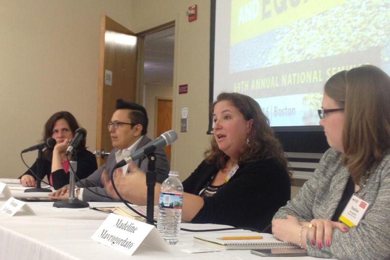
No worries. Experts assembled for a recent Education Writers Association panel shared strategies to enlist data to tell your story, and how to convey it visually, with tips for math phobes and number nerds alike.
Data is simply a collection of structured stories, said Alvin Chang of Vox Media. Think of every row in a chart as a story, and every visual element as a sentence, he advised. Then ask: How is it better than a sentence? (If it’s not, maybe it shouldn’t be a chart.)
When considering how to convey data to readers, said Dana Chinn, a lecturer at the University of Southern California, remember that ”we’re not just plopping out data.” For example, running a chart on the number of cats and dogs at an animal shelter, she said, would be “a big ‘so what?’ ”
Instead, often what stories intend to depict is the relative or percent change.
Use Meaningful Numbers
And here’s what Chinn, who teaches data journalism, advises: “Keep the number of digits in a paragraph to eight.”
Yes, that’s right. That’s four two-digit numbers. Or two years.
And use meaningful numbers. So, rather than report that “city animal shelters took in 803 more animals in April,” find the relative change: “The shelter took in 21 percent more animals in April.” Better yet, eliminate the numbers: “The shelter took in one-fifth more animals.”
When designing a chart, limit colors to three, she said, and use the same color to represent the same variable to make comparisons easy.
Furthermore, avoid pie charts, which are difficult for readers to grasp.
“A multi-slice pie chart is completely useless,” Chinn said.
Bar Charts Are Often a Good Bet
Bar charts are the most effective way of communicating data, according to Chinn.
When thinking about displaying data, first ask if it can be a bar chart, Chang said. Bar charts are very good at depicting change over time, showing comparisons of A versus B, and doing both comparisons over time and how things compare.
“It’s mind-blowingly simple,” Chang said.
He advised avoiding scatter plots — those graphs populated with little dots — because while researchers love them, most people don’t know how to read them. (However, superimposing a trend line to show the overall tendency of the data does make them less confusing).
If you find yourself doodling to express an idea to your editor, maybe that doodle can be turned into a graphic to illustrate the data, Chang said.
And before starting, make sure your data is “clean.” That is, that it’s consistent, complete and comparable — that peoples’ names, for instance, aren’t listed in different formats.
“Most of data journalism is sitting there tediously cleaning data until you start leaving your body,” said Daniel Willis of EdSource, who also participated in the EWA discussion. “You get to the fun part, then it’s over and then you start cleaning again.”
Tools for cleaning include OpenRefine, Google Sheets, Datawrapper, Highcharts (for those who know a little bit of coding) and D3 and Tableau (for those who code a lot).
That can become rather involved and sophisticated.
Willis advised journalists that if they learn one thing, it should be how to calculate percentages, useful for many stories. (He lamented that for months after leaving the Bay Area News Group, ex-colleagues still pestered him to figure out percentages for them.)
If you’re wondering about making your design interactive, Chang said, “think how much investment is a reader going to put into a story. Most people will come to a page and leave. If it’s worth somebody exploring and finding something new, then making it interactive is worth it.”
In planning a chart, Willis advised writers to shop around their design.
Does Your Chart Pass the ‘Mom Test’?
“As journalists, we get so wrapped up in the story that we know it really well,” he said. “We put together a chart that to us makes perfect sense. Then we show it to someone wandering by our desk, and they glaze over and wander away.”
He added, “Make sure that happens before publication.”
Or there’s this test: If Willis suspects a chart is too complicated, he sends it to his mom to ask what she think it means. It doesn’t always pass.
Finally, Chinn said, posting data online involves a forever commitment.
“Any data set you report should be updated,” he said. “It becomes part of your beat. If it’s worth the time to put data in and clean it, it’s worth your time to update it. You’ve made assumptions in cleaning data that you need to keep testing.”
He added, “Make a commitment that you’re going to keep updating it for years.”


